Sales Material - Before & AfterPremiere and Countdown assets
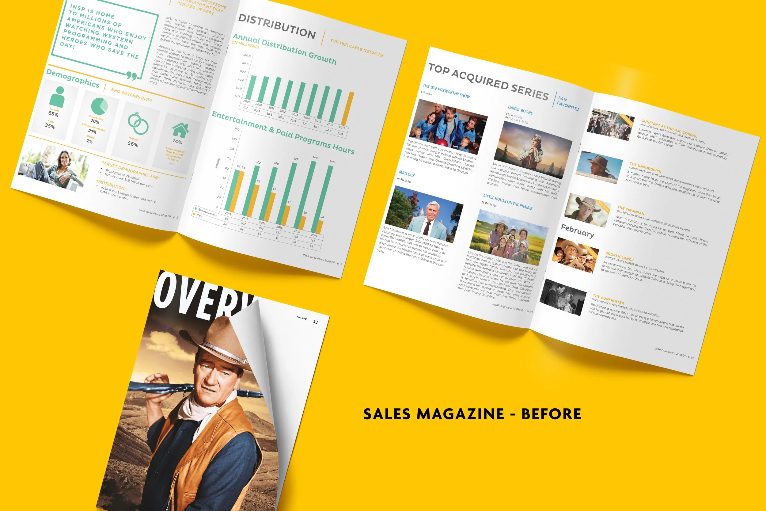
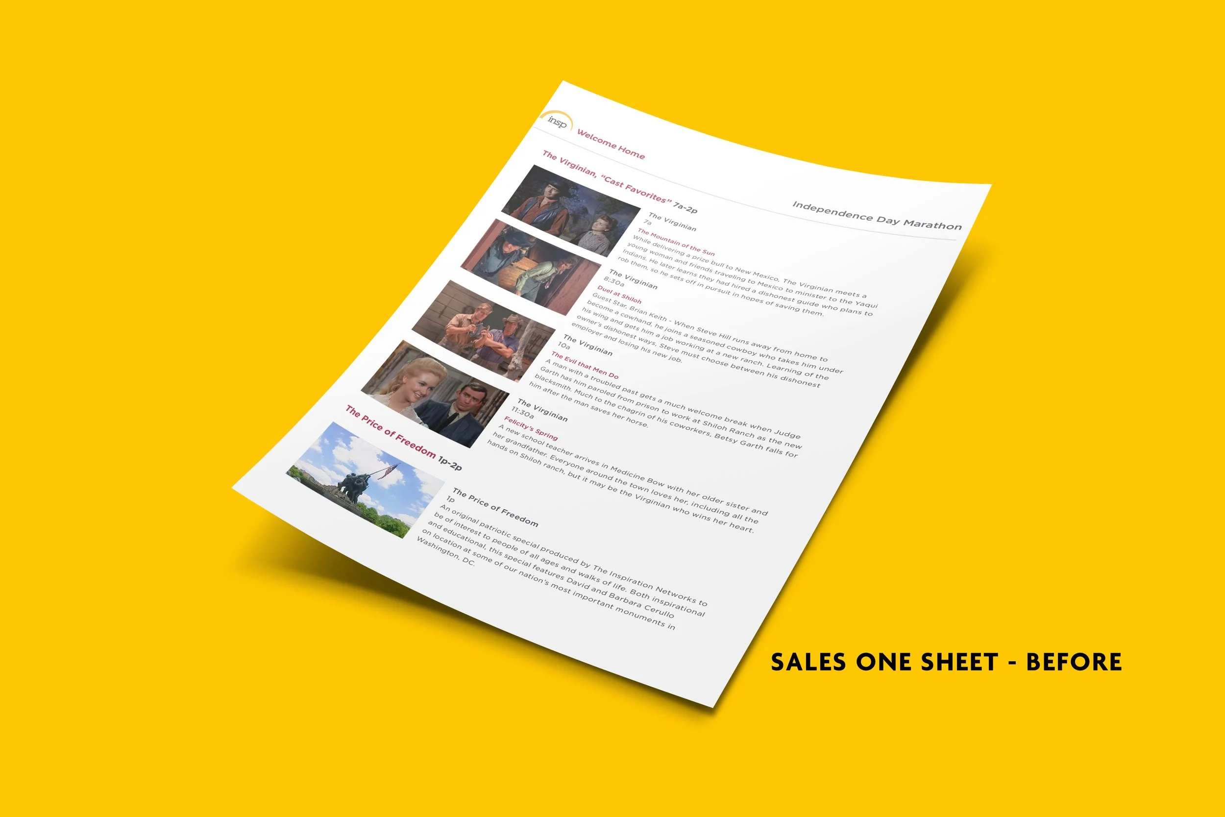
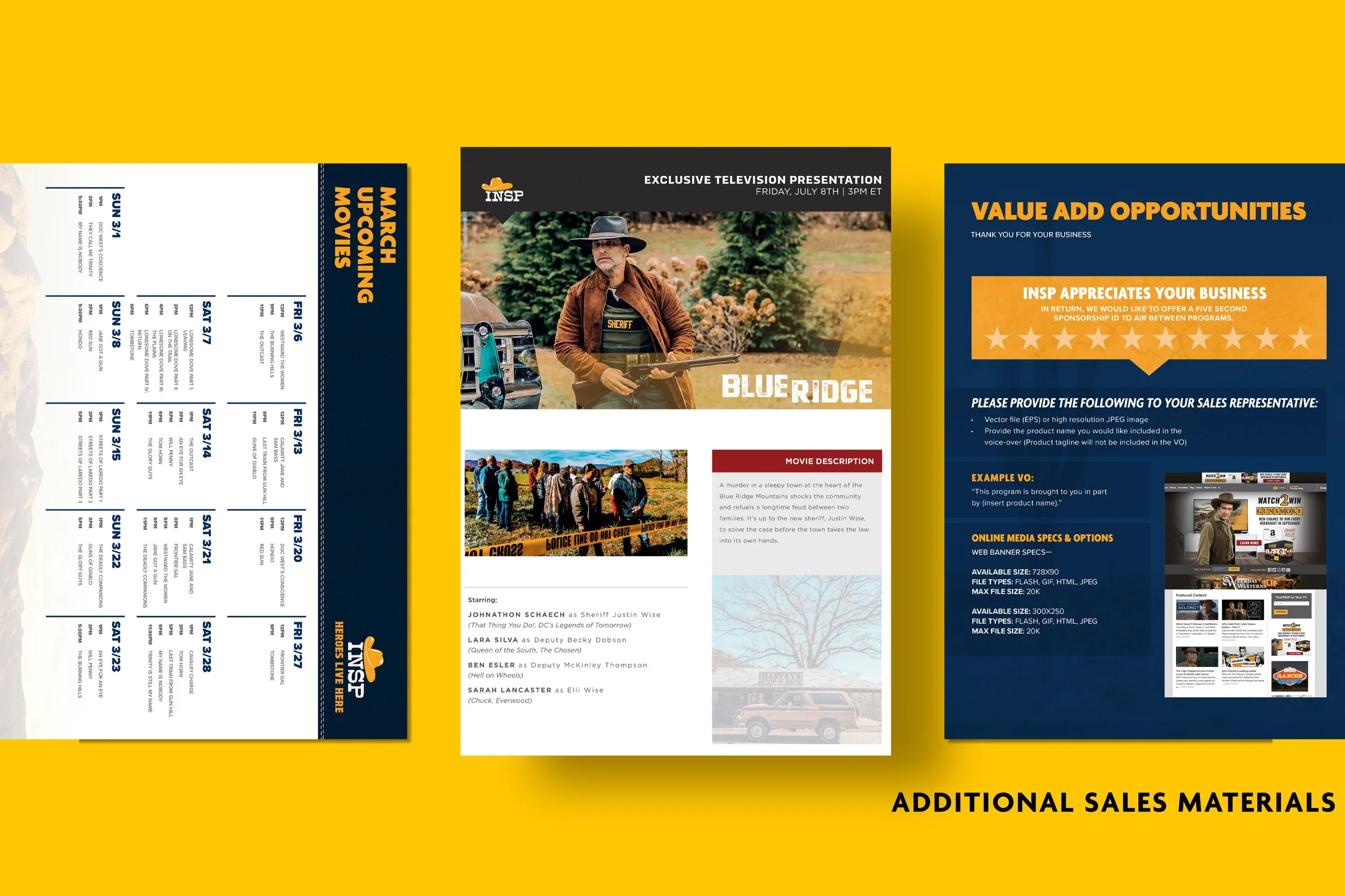
I led the rebrand of INSP’s quarterly sales one-sheets and magazine, evolving them from schedule-heavy, text-dense layouts into cinematic, campaign-driven presentations. The original materials focused primarily on listings and copy, with limited visual hierarchy and minimal brand storytelling.
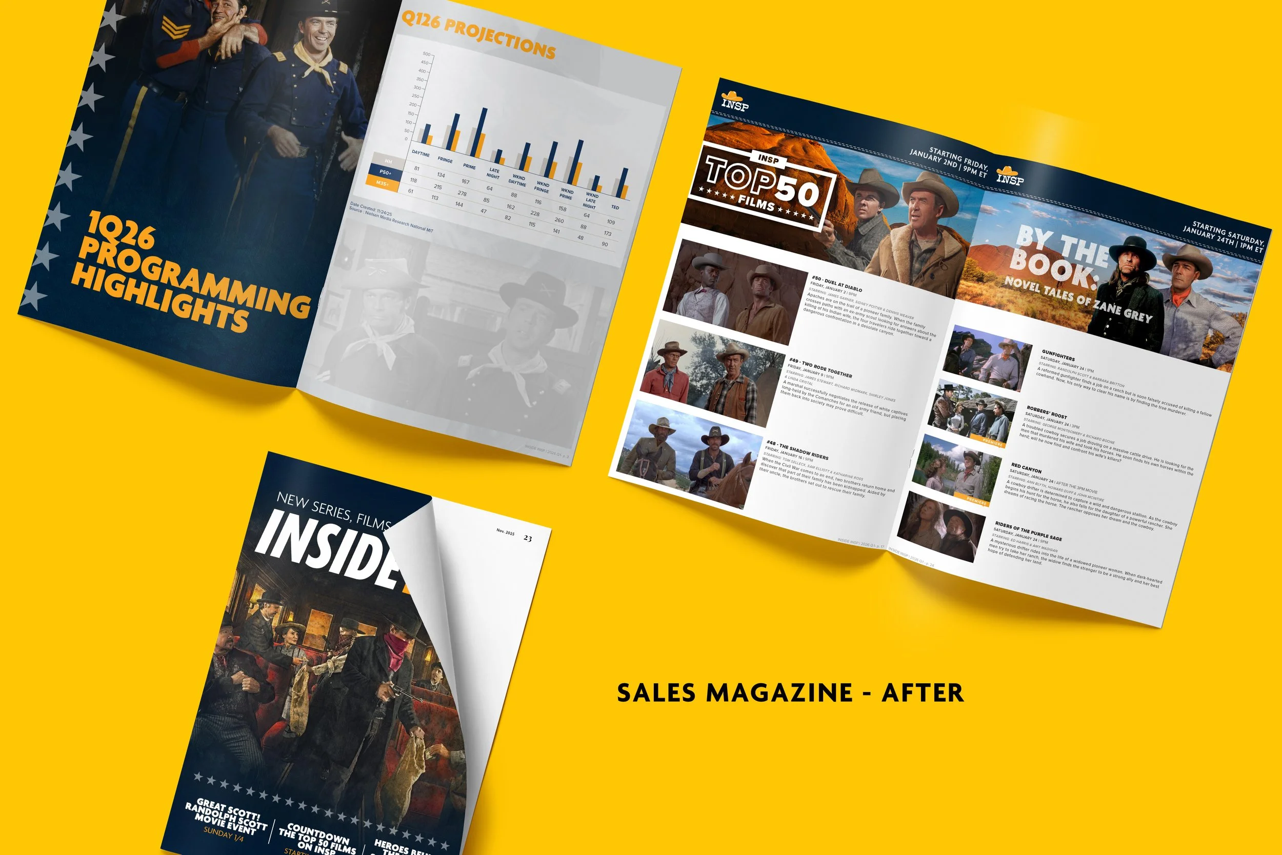
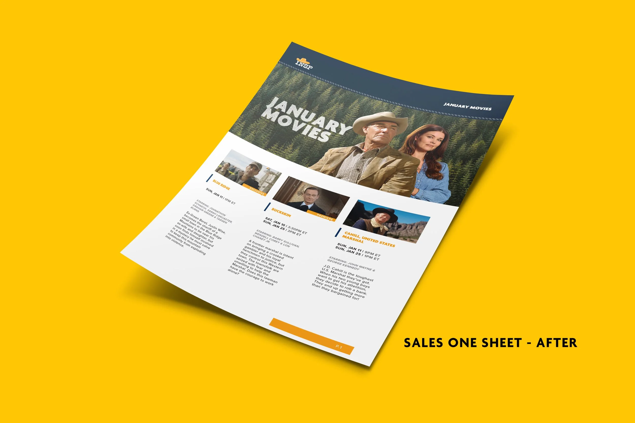
The redesigned versions repositioned these pieces as premium sales tools—anchored by bold key art, stronger typographic hierarchy, clearer programming buckets, and a more cohesive Western-inspired brand aesthetic. The updated approach prioritized impact at first glance, simplified the information architecture for faster readability, and elevated the overall perception of the network’s slate for advertisers and distribution partners.
The result: materials that functioned not just as schedules, but as brand-forward pitch decks—aligning sales communications with the same cinematic tone used in consumer marketing.